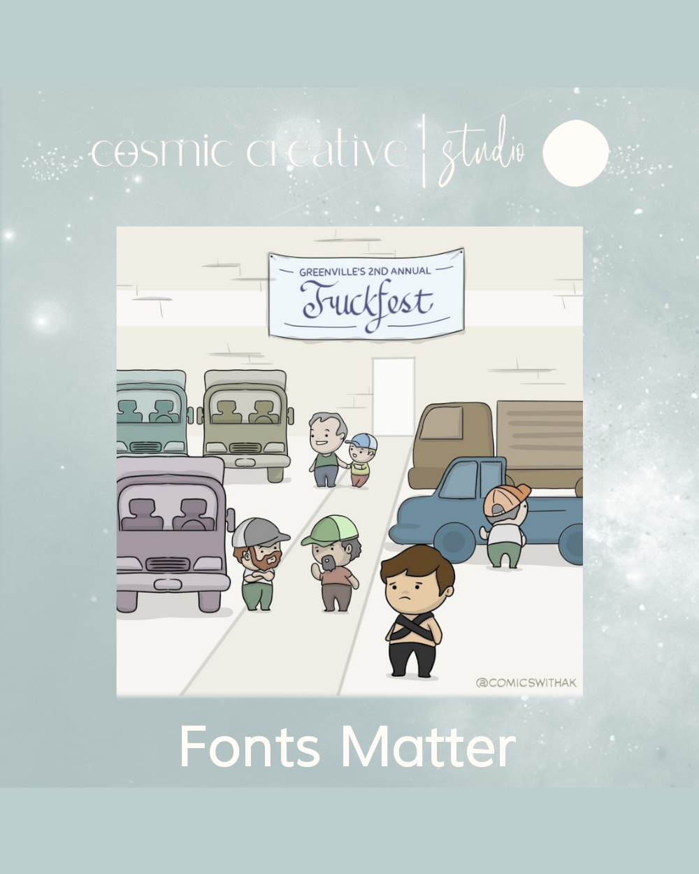
Whether you’re designing something yourself or reviewing work submitted by a graphic designer, there are some key considerations to make when deciding what font to use for your project.
The most important determining factor between a good font and a bad one is legibility. The whole point of any text or copy is effective communication. So when deciding what font to use for your brand or design, ask yourself the following questions:

-
Is the font effectively communicating what you’re trying to convey?
-
Can the font be read at different sizes to support different applications and contexts?
-
Is it easy to read on screens with different resolutions?
-
Is it easy to read across print assets of various sizes?
Fonts also communicate personality and are a foundational aspect of branding. Your typography choice will solidify brand your identity and good font can inspire a sense of confidence, professionalism, and trust in a brand.
Fonts, just like all things involving style and aesthetic, go in and out of fashion. Our graphic design comrades of old would all too well remember the era of ‘Papyrus’ font for health & wellness brands and ‘Thirsty Rough’ for trendy cafes. So it’s important to go for something that is as timeless as it is reflective of your brand’s personality and intent.
We’ll leave you with a few tips to help you choose the right font for your brand:
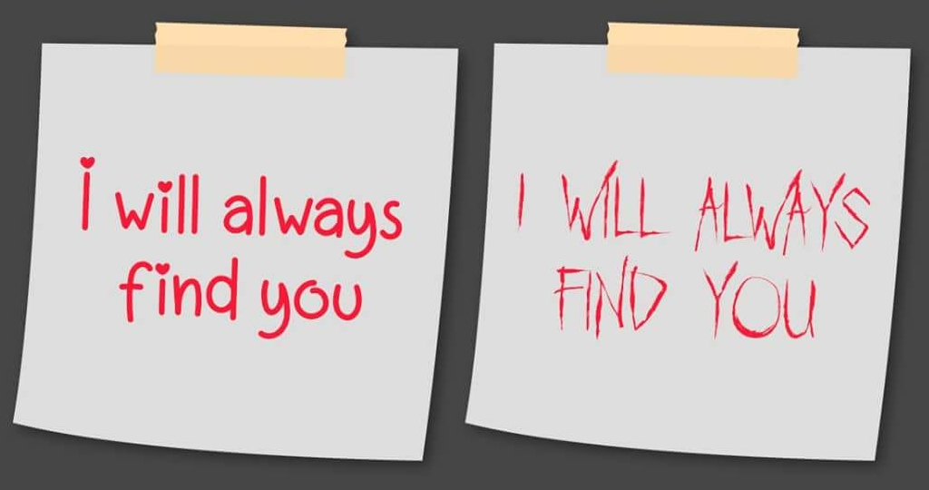
- Fonts can literally alter the meanings of words right before our very eyes. Don’t believe us? Check out these hilarious font fails.
- When looking at typography, get a feel for what personalities the fonts have. Think about what a font reveals about your brand’s personality.
- Explore how you respond to fonts emotionally and make them work for the message you’re trying to send rather than against it.


